Making an accessible web
When companies design and develop websites or software, they need to know that many users with accessibility issues with using their products. 👓
Some commons issues are:
Low contrast on text.
Background and foreground colors do not have a sufficient contrast ratio.
Link text missing.
A lot of navigation links.
And more.
Examples
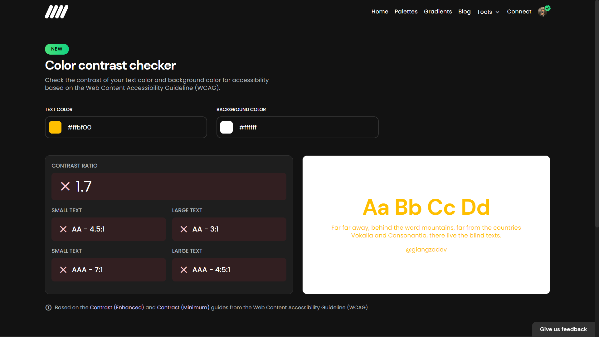
BAD ❌
This example is a prevalent example of a lousy contrast ratio. I have seen many websites using a white background with yellow text. As you can see, this example doesn't pass any contrast ratio test, so it'll be illegible for many people with accessibility issues.
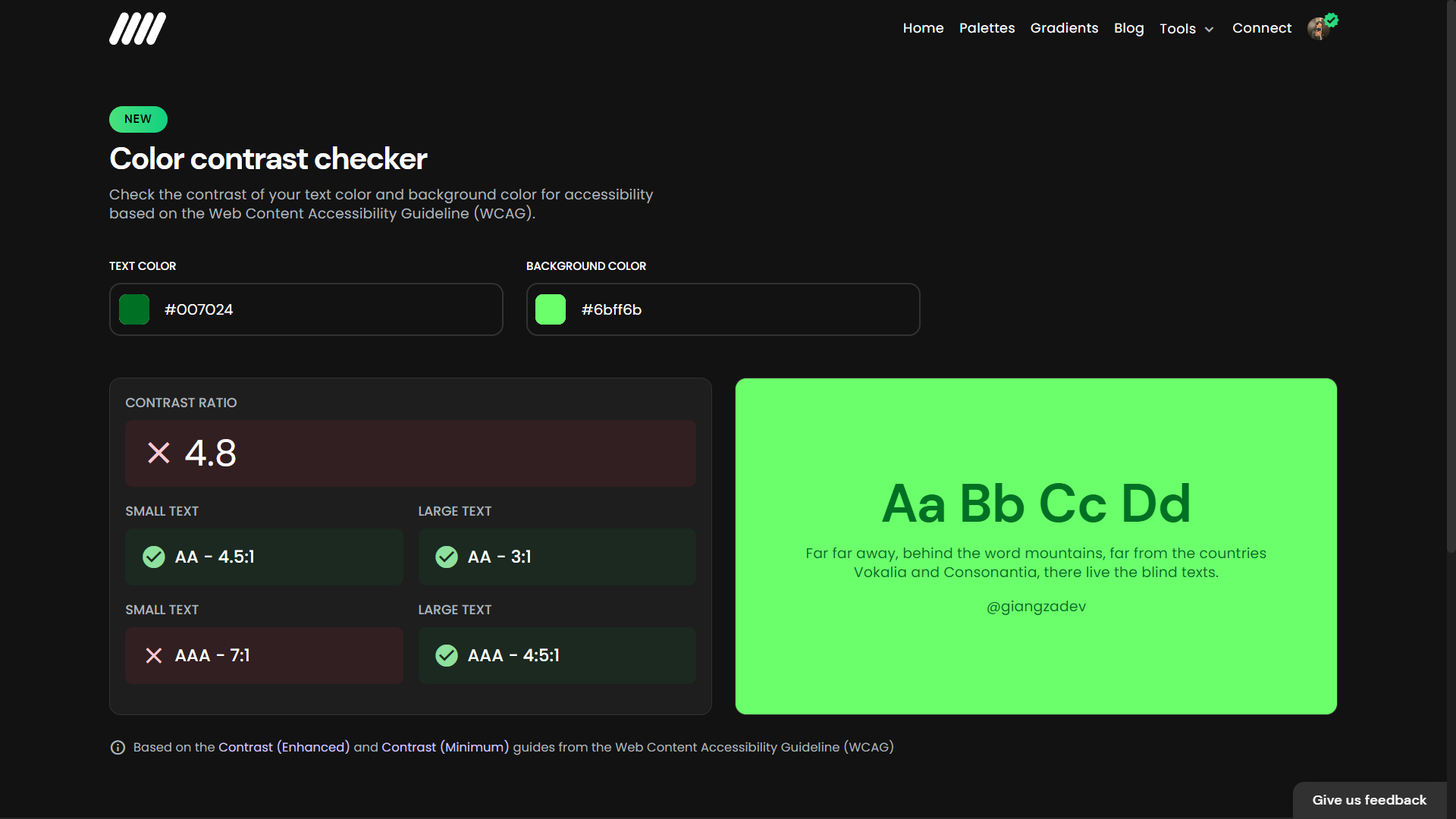
Same here with this green colors example. But the difference here is that it passes the significant text and one small text, but overall it doesn't give all the tests, and it could be accessible for some people, but the one with the most intense issues will have problems reading your texts.
GOOD ✅
We already saw some bad examples. Now it's time to see good examples with all the contras ratio test passes.
This first example uses a light color as the background and a darker color for the text, and the results are excellent because it passes all the contrast tests.
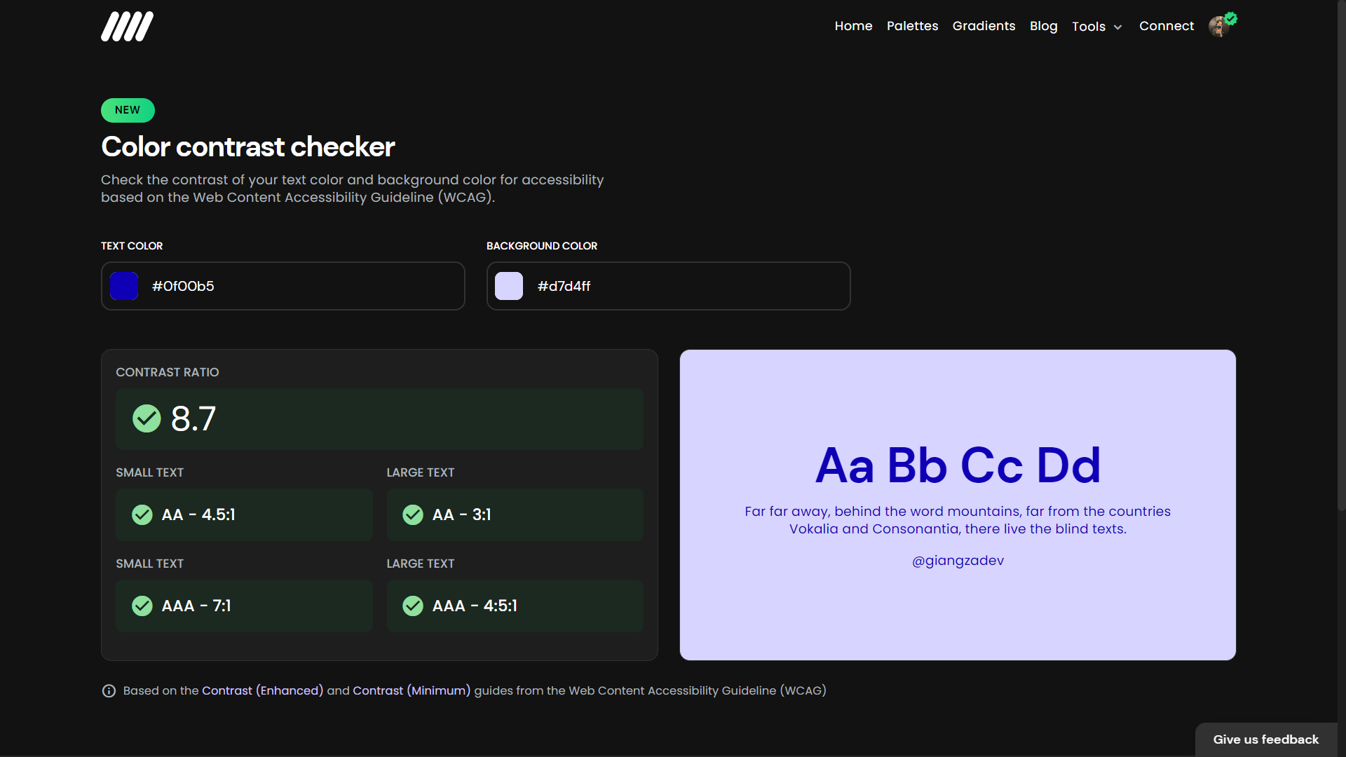
Another example is using the same technique as the previous example but inverse. Instead of a light background, we can use a darker background and a light color for the text.
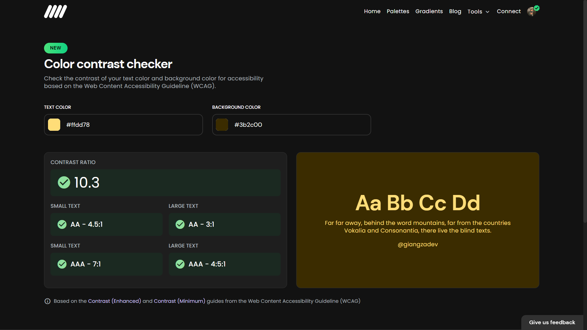
This yellow example is prevalent in dark mode themes. Companies like Google use this style when using yellow as the primary color. ✨
A perfect example, as we can appreciate in this example from the Material You website.
Speaking of Material You, they have a fantastic guide for accessible mobile design, and you can learn super helpful tips on Google Material You.
What do we need to do?
Something straightforward, you can use Colorffy's Contrast Checker tool to choose the colors you want or already have on your website. If the contrast ratio fails, move the background or text color to something darker or lighter, depending on your case, to make it accessible for all your users!.
Gradients for backgrounds
If you want to use some fancy Google fonts but don't know what font to use, check out the Top 5 Beautiful Google Fonts post. 📝
Thank you! ✅
And that's a wrap! It was easy. 🤩
I hope it will be helpful for you and if you have any questions, send me a DM on Twitter. ✌🏻