
Modern gradients era ⤵️
Gradients used to be one of the top styles years ago, then the flat design replaced it, and in the past the years, many other styles arrived, like "neumorphism," glass effect styles, material design, and many others.
Nowadays, the gradients are back, but different, vivid, and neon gradients are ruling many companies' styles like Stripe, OpenAI, Meta with Messenger, and Instagram this time.
As you can see, these companies are opting to use colorful gradients on their logos, backgrounds, design, etc.
For this reason, I want to show you a straightforward way to create similar and stunning gradients that you will be able to use on your design, website components like buttons, hero sections, background, card, or whenever you want to give it a try.
Getting inspiration 📸
What's best to inspire of that the nature itself? Look at the sunrise or sunset in your city, and you will appreciate a natural and stunning orange/pink gradient!
Look at the ocean, the sky in the afternoon, flowers, betta fishes, and many more things from nature itself.
Let's use the following photo taken by me with no filter of a sunset to create a stunning gradient.

As you can see in the picture, the sky has an orange/red-orange color. I'll use the gradient generator from Colorffy to recreate a gradient with similar colors. 👇
https://colorffy.com/gradient/generator
Color picker
First, I used the Color Picker from an image tool to get the primary colors from my photo.
https://colorffy.com/color-image-picker
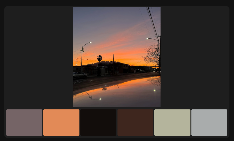
Getting the palette
After I get the orange color from my photo (#e28a57), I go to the Color Schemes tool to get shades and tints tones from my hexadecimal color.
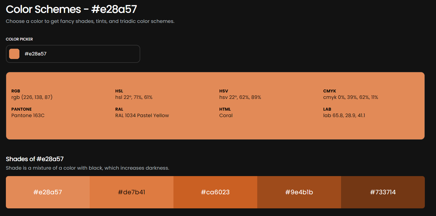
Creating a stunning gradient
So far, I have my hexadecimal color, and thanks to the Color Schemes tools, I have four different shades from my base color. And with these colors, I can create a beautiful gradient that will combine and looks natural. 🔥
https://colorffy.com/gradient/generator
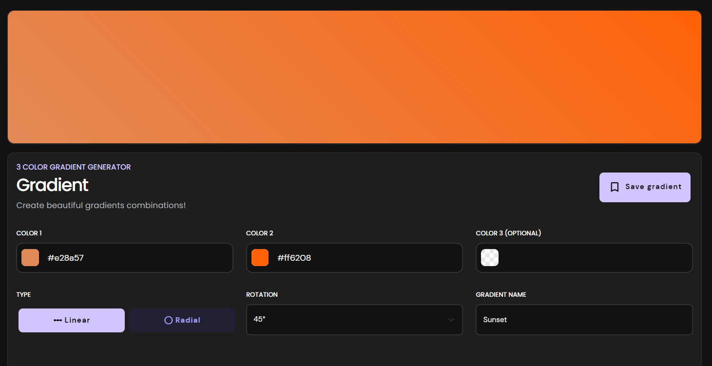
In my gradient generator, I paste the color values that I get from the previous step, and in this case, I only use two colors, but if you want to use an extra color, add a third color.
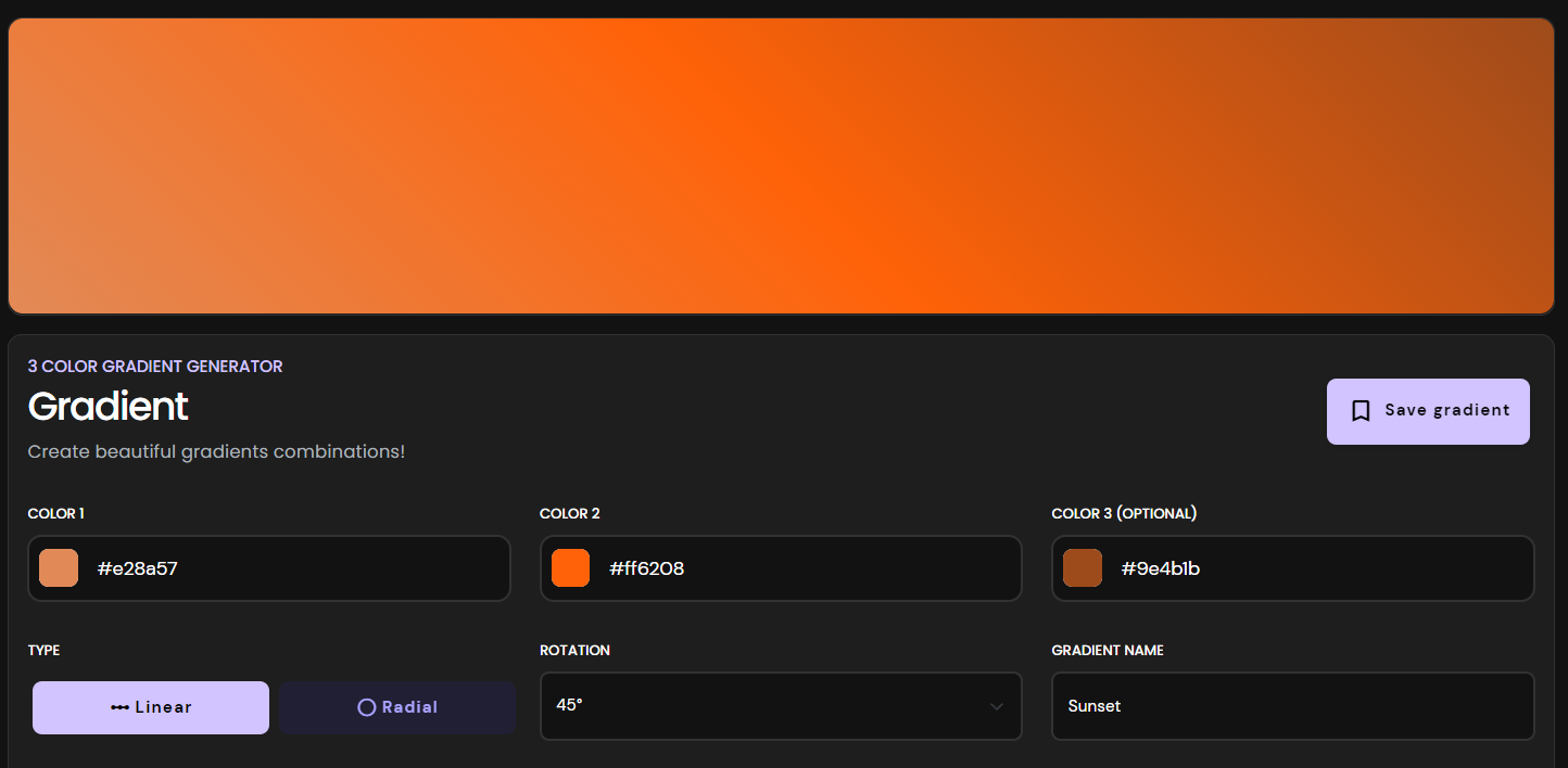
As you can see in this example, using three colors, the top-right edge looks darker. Now our gradients based on a sunset look beautiful. 🌇
Preview the gradient
Thanks to our saving gradients feature, you can save your beautiful gradients, but be sure to be logged in before you start creating your gradient! ✅
After saving our gradient, we can check it out and scroll down to the UI PREVIEW COMPONENTS section.
The result 🚀
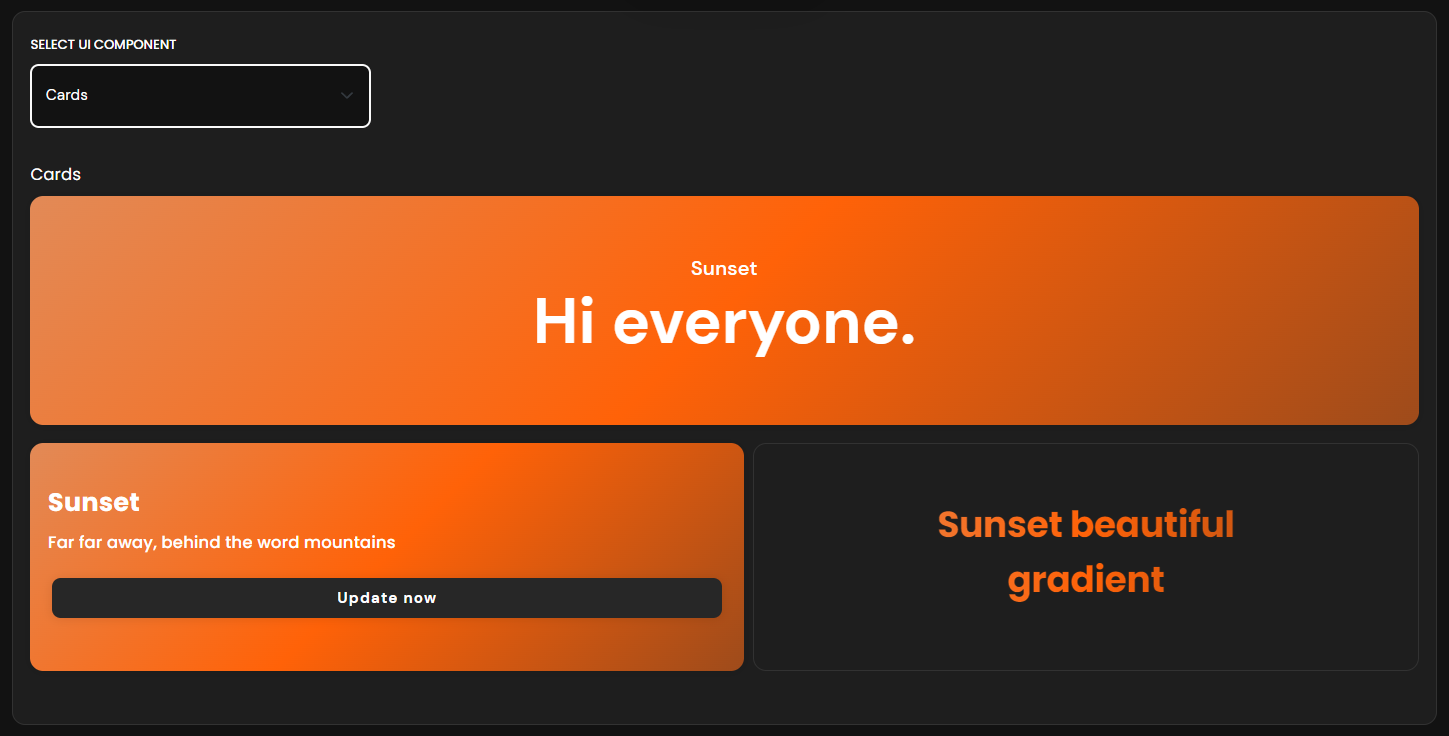
You can preview buttons, cards, and text with your gradient color.
CSS
And of course, the CSS to use this perfect gradient to our components from our project, or using it on a design from Figma, Illustrator, etc.
background: linear-gradient (45deg, #e28a57, #ff6208, #9e4b1b);Thank you! ✅
That's all for this post from today. I hope it will be helpful for you and if you have any questions, send me a DM on Twitter. ✌🏻