Learn how to create an animated sidebar using Vue and SCSS. 👇
First, we need a Vue project created and SCSS installed. I will not show you how to create a Vue project in this tutorial. So, after we have the project installed and ready, we'll need five files:
HomeView.vue - The default Vue view (LOL)
TheSidebar.vue - The Vue component
"_variables.scss " - The main variables for our SCSS files
"_sidebar.scss" - The styles for the sidebar
"main.scss" - The main SCSS file.
Creating the Sidebar component
You can create the sidebar component by simple pressing the right button on the mouse on the "src" folder, then create a new folder named "components" after that, repeat the same action but in the new component folder and create a file named: "TheSidebar.vue". ☕
Adding the component to our view
Add the new component, and don't forget to import it to your view.
<TheSidebar/>

<script>
import TheSidebar from "@/components/TheSidebar";

export default {
 components: {TheSidebar},
}
</script>
Coding TheSidebar.vue.
The first thing we need to start our sidebar is the HTML code, so in this example, I create the main skeleton and default HTML for a sidebar.
The sidebar-content will wrap the header, the body, and the footer, using flex.
<template>
  <div>
    <div class="sidebar">
      <div class="sidebar-content">
        <div class="sidebar-header">
          <p>Components menu</p>
          <button class="btn btn-sm btn-link">
            X
          </button>
        </div>
        <div class="sidebar-body">
          <ul>
            <li class="sidebar-item">
              <router-link to="/">
                <i class="material-icons-outlined">code</i>
                Sidebar
              </router-link>
            </li>
          </ul>
        </div>
        <div class="sidebar-footer">
          <a href="https://blog.colorffy.com" target="_blank" rel="noopener">
            By: blog.colorffy.com
          </a>
        </div>
      </div>
    </div>
  </div>
</template>
The SCSS
Like the Vue files, we need to create three SCSS files, or you can do it in one file, but for better practices, I'll use three different files. 💻
Variables
I create these variables before coding the sidebar SCSS file because I like to have the variables ready to reuse some of them and avoid repeating hexadecimal colors, sizes, radius, etc.
// SIDEBAR COLORS
$bg-sidebar: #ffffff;
$color-on-sidebar: #121212;
// BORDER RIGHT COLOR
$color-border: #dadce0;
// BUTTON STATES COLORS
$color-muted: #52595f;
$color-primary: #15DC9B;
// UTILS
$space-3: 3rem;
$border-radius-8: 8px;
// TRANSITIONS
$transition-sidebar: .2s ease-in-out;
$transition-cubic-bezier: all 0.3s cubic-bezier(.25, .8, .25, 1);
Sidebar
This file is almost 100 lines of code, but it includes the sidebar styles, the class for hidden, sidebar links, header, body, footer, and even some hover states. 🔥
@use "sass:math";

.sidebar {
  position: fixed;
  top: 0;
  left: 0;
  transform: translateX(0px);
  opacity: 1;
  visibility: visible;
  width: calc(#{$space-3} * 6);
  height: 100%;
  background-color: $bg-sidebar;
  color: $color-on-sidebar;
  border-right: 3px solid $color-border;
  transition: $transition-sidebar;
  z-index: 99;
  padding: 20px;

  &.sidebar-hidden {
    transform: translateX(-300px);
    opacity: 0;
    visibility: hidden;
  }

  .sidebar-content {
    display: flex;
    flex-direction: column;
    flex-basis: auto;
    flex-wrap: nowrap;
    height: 100%;
    min-height: 100%;

    .sidebar-header {
      padding: 10px;
      display: flex;
      justify-content: space-between;
      flex-wrap: wrap;
      word-break: break-all;
      align-items: center;
      border-bottom: 1px solid $color-border;

      p {
        font-weight: 700;
      }
    }

    .sidebar-body {
      padding: 10px 5px 10px 5px;
      margin: 20px 0 20px 0;
      overflow-y: scroll;
      overflow-x: hidden;
      flex: 1;

      .sidebar-item {
        color: $color-muted;
        border: 1px solid transparent;
        border-radius: $border-radius-8;
        transition: $transition-cubic-bezier;
        padding: .5rem;
        margin-bottom: .5rem;

        a {
          text-decoration: none;
          background-color: transparent;

          i {
            margin-right: math.div($space-1, 3);
          }
        }

        &:hover {
          background-color: scale-color($color-primary, $alpha: -90%) !important;
          font-weight: 700;
        }

        &.disabled {
          background-color: scale-color($color-muted, $alpha: -85%);
          opacity: 0.5;

          a {
            color: $color-muted;
          }
        }
      }
    }

    .sidebar-footer {
      display: flex;
      flex-wrap: wrap;
      flex-direction: column;
      justify-content: center;
      padding: 10px;
    }
  }
}
Main
Then, after creating both variables and a sidebar file, we need to import them to a "main.scss" file. This main file will have all our SCSS, and with it, we need to import it into the "App.vue" file.
@import "base/variables";
@import "components/sidebar";
Import it like this, after the template tag:
<style lang="scss">
@import "./assets/scss/main.scss";
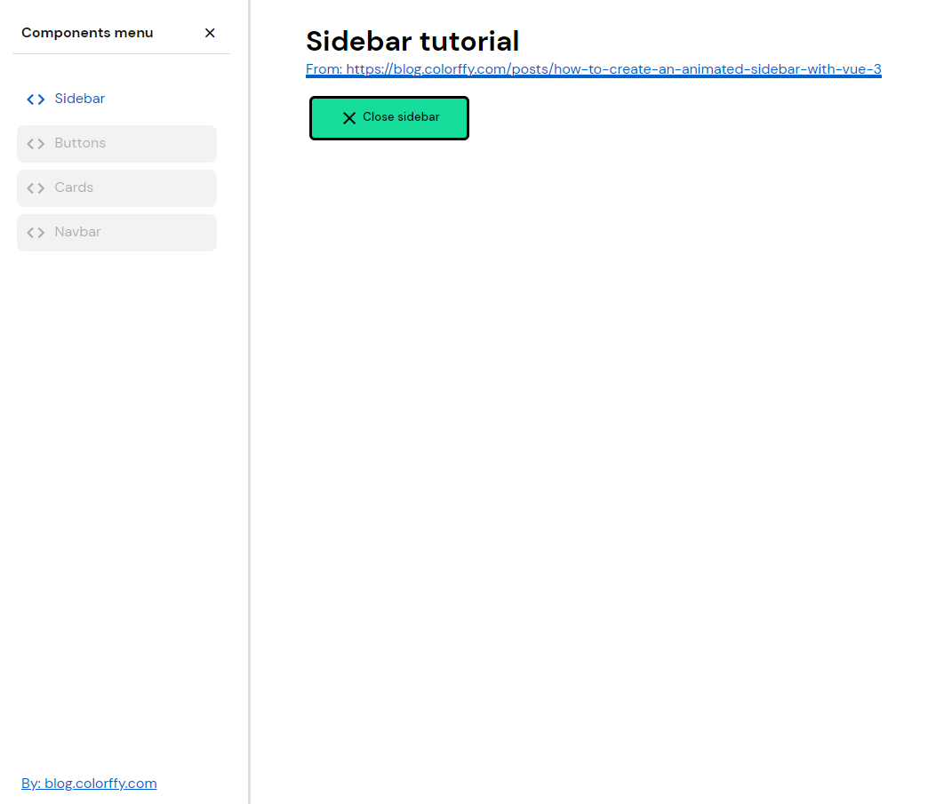
</style>With these Vue and SCSS files, we will have this result. (Only the sidebar, not the button or the link styles)
Javascript
Great! We already have a nice sidebar, but we need one more thing....make it work with javascript!
To make it close and open works, we need to add data to the HomeView.vue and a new method.
export default {
  name: "HomeView",
  components: {TheNavbar, TheSidebar},
  data() {
    return {
      isSidebarActive: true
    }
  },
  methods: {
    toggleSidebar() {
      this.isSidebarActive = !this.isSidebarActive
    }
  }
}
Our script tag will look like this.
The data will have a true or false value that will change when the method runs. The method will run after a button with the event @click is pressed.
Add a button with a @click event with the same method name we created. This code will trigger the methods when the user presses the button, and as an extra, it will change the title of the button to "Close" or "Open," depending on if the sidebar is open.
<button class="btn btn-primary"
         @click="toggleSidebar()">
     {{ isSidebarActive ? 'Close sidebar' : 'Open sidebar' }}
</button>
TheSidebar.vue component
We need to declare two props and pass a Boolean and a Function types.
<script>
export default {
  name: "TheSidebar",
  props: {
    isSidebarActive: {
      type: Boolean,
      default: null
    },
    sidebarToggle: {
      type: Function,
      default: null
    }
  }
}
</script>
Editing the HTML from the component
Let's wrap the sidebar class on an array of classes that will change depending on the value of the isSidebarActive data. This action will make the sidebar appear or hide when the user clicks the button.
<div :class="['sidebar', isSidebarActive ? '' : 'sidebar-hidden']">As an extra, we can add a button with a @click event on the sidebar header to be able to close the sidebar from the "X" close button.
<div class="sidebar-header">
     <p>Components menu</p>
     <button class="btn btn-sm btn-link"
             @click="sidebarToggle()">
           X
     </button>
</div>
Last modification! ☕
After declaring the props on the component and adding the data and the method to the view, the last thing we need to do is pass the data from our view to the component like this:
<TheSidebar :is-sidebar-active="isSidebarActive"
            :sidebar-toggle="toggleSidebar"/>
Sidebar ready and done ✅
And that's a wrap! Following all these steps, you'll be able to have an incredible and working sidebar for your project.
Here's is the GitHub repository if you need to see more SCSS styles or fork it:
https://github.com/giancarlosgza/vuejs-components-web-app
Thanks for reading this tutorial! And see you on the new one. 🔥
If you have any questions, don't doubt to send me Twitter DM @giangzadev
Source Code icon by Icons8